
Technical Reference · Display Optics & W3C CSS Units · Updated November 2026

Complete Screen Calibration & PPI Measurement Guide

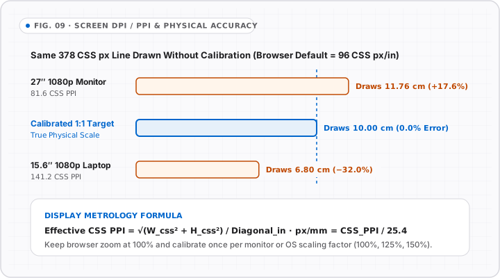
Display calibration bridges the gap between abstract W3C 96-PPI CSS reference pixels and the physical millimeter pixel pitch of your hardware panel.

Section 01 · Pixel Pitch Math

What is the difference between physical PPI and CSS pixels?

Physical Pixels Per Inch (PPI) is a fixed hardware property determined by a display panel’s native pixel resolution and diagonal size in inches, calculated as Physical PPI = √(W² + H²) / diagonalInches. By contrast, a CSS pixel is an abstract angular unit defined by the W3C CSS Values and Units Module Level 4 specification at exactly 1/96 of a CSS inch (3.7795 CSS pixels per millimeter). When an operating system applies HiDPI scaling—such as devicePixelRatio = 2 on Retina Macs or 1.25 to 1.5 on Windows laptops—each CSS pixel spans multiple physical subpixels. Online Ruler Plus calibrates in CSS pixels per millimeter (pxPerMm) and stores physical density (devicePxPerMm = pxPerMm × dpr) so your ruler stays consistent across browser zoom changes.
Section 02 · Physical Standard

Why is the ISO/IEC 7810 ID-1 card standard ideal for calibration?

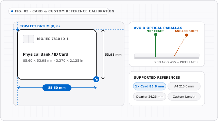
The ISO/IEC 7810:2019 ID-1 standard is the international dimensional specification governing bank cards, credit cards, driver licenses, and national identity cards worldwide. According to ISO/IEC 7810, every ID-1 card measures exactly 85.60 mm (3.370 in) in width, 53.98 mm (2.125 in) in height, and 0.76 mm in thickness, with a 3.18 mm (0.125 in) corner radius. Because card blanks are die-cut to sub-millimeter tolerances globally, matching an on-screen rectangle to a physical ID-1 card directly measures pxPerMm = cardWidthPx / 85.60 on your screen. In practice, this optical alignment bypasses OS scaling distortion, multi-monitor EDID errors, and browser privacy restrictions without requiring hardware lookups.

Section 03 · Scale Subdivisions

How are metric millimeter and 1/16″ fractional graduations calculated?

Ruler graduation rendering is governed by the international yard and pound agreement (NIST / BIPM), which defines 1 imperial inch as exactly 25.4 millimeters and 1 centimeter as 10 millimeters. In Centimeter (cm) and Millimeter (mm) modes, Online Ruler Plus generates minor ticks every 1.0 mm, medium ticks every 5.0 mm (0.5 cm), and labeled major ticks every 10.0 mm (1 cm). In Inch (in) mode, every 25.4 mm inch interval is divided into 16 dyadic fractions of 1/16 inch (1.5875 mm): Level 1 marks 1/2 in (12.70 mm), Level 2 marks 1/4 and 3/4 in, Level 3 marks odd eighths, and Level 4 marks odd sixteenths.

Section 04 · Secondary Verification Standards

Which everyday coins, bills, and paper sizes verify screen calibration?

After calibrating via credit card or display diagonal, you can cross-check physical scale accuracy using regulated everyday items. According to United States Mint specifications, a US One-Cent Penny measures 19.05 mm (exactly 0.750 in or 3/4 in) in diameter, a US Nickel measures 21.21 mm (0.835 in), and a US Quarter Dollar measures 24.26 mm (0.955 in). According to European Central Bank specifications, a 1 Euro coin measures 23.25 mm (0.915 in) and a 2 Euro coin measures 25.75 mm (1.014 in). For longer spans on desktop monitors, a US Federal Reserve Note measures 155.96 mm (6.14 in) wide, an IEC R6 AA battery measures 50.50 mm long, and an ISO 216 A4 sheet measures 210.0 mm across its short edge.

Section 05 · Zoom & Multi-Monitor Persistence

How does Online Ruler Plus handle browser zoom and external monitors?

Browser zoom and multi-monitor window movement alter window.devicePixelRatio and window.screen dimensions in real time. To prevent silent measurement drift, Online Ruler Plus converts your calibrated CSS scale (pxPerMm) into an invariant physical hardware density (devicePxPerMm = pxPerMm × dpr) keyed by display resolution signature in localStorage. When you zoom your browser on the same monitor, the display observer detects that the physical panel signature matches and divides devicePxPerMm by the new zoom ratio. If you drag the window onto a different external monitor, a status banner prompts you to verify calibration for that panel.

Section 06 · Worked Calibration Calculations & HiDPI Matrix

How CSS PPI, Physical PPI, and devicePxPerMm Relate Across Displays

Web browsers expose viewport CSS pixels rather than raw native LCD/OLED panel subpixels when HiDPI operating-system scaling is enabled. Using the Pythagorean diagonal formula on CSS pixels at 100% browser zoom yields exact CSS px/mm directly, while multiplying by window.devicePixelRatio yields zoom-invariant devicePxPerMm.

Worked Density Table by Display & OS Scale

Display ConfigurationCSS ResolutionEffective CSS PPICSS px/mmdevicePxPerMm
14.2" Laptop (Mac Retina / 2× DPR)1512 × 982 CSS px (DPR 2.0)5.000 CSS px/mm10.000 device px/mm
15.6" Windows Laptop (125% OS Scale)1536 × 864 CSS px (DPR 1.25)4.448 CSS px/mm5.560 device px/mm
24" 1080p Desktop Monitor (100%)1920 × 1080 CSS px (DPR 1.0)3.614 CSS px/mm3.614 device px/mm
27" 4K UHD Monitor (150% OS Scale)2560 × 1440 CSS px (DPR 1.5)4.283 CSS px/mm6.425 device px/mm
6.1" OLED Smartphone (3× DPR)390 × 844 CSS px (DPR 3.0)6.000 CSS px/mm18.000 device px/mm

OS Scaling Caveat · Fractional & Custom PPI

Why card calibration outperforms guessed diagonal entry on scaled desktops

Many users know they bought a "15-inch" or "27-inch" computer, yet real visible active panels often measure 15.6 inches, 16.0 inches, or 26.9 inches—and ultrawide or external monitors sometimes receive non-integer OS fractional scaling (Windows 125% or 150%, Linux Wayland fractional scaling, or macOS "More Space" scaled resolutions that render to a virtual framebuffer before downsampling). Those hidden framebuffers shift effective CSS PPI without changing the physical glass diagonal. Calibrating with a physical 85.60 mm ID-1 bank card measures the true end-to-end rendered pixel ratio on your screen directly, eliminating guesswork in under 15 seconds.

Smartphone Constraints · Narrow Viewports

Why mobile phones switch to Portrait Card Calibration (53.98 mm)

A smartphone in portrait orientation typically measures 360 to 430 CSS pixels across (~58 to 72 mm physically). Because a landscape bank card is 85.60 mm wide, holding it horizontally overflows the phone screen and clips the alignment border. Whenever viewport width drops below landscape card bounds, Online Ruler Plus provides a dedicated Portrait Card Mode calibrated to the card’s short 53.98 mm height (pxPerMm = cardShortEdgePx / 53.98), letting mobile users achieve crisp 1:1 physical accuracy vertically or rotate to landscape for longer runs.

Windows 125%/150% & Android Chrome

How to Calibrate Windows Scaled Laptops & Android Phones

On Windows 10/11 laptops running 125% or 150% ClearType display scaling, or Android Chrome viewports (~360–412 CSS px wide), browser PPI defaults shift away from physical glass pitch. Keep browser zoom at 100%, open Calibration below, switch Android devices to Portrait Card Mode (53.98 mm width), and drag until an ISO ID-1 card matches edge-to-edge.

Section 07 · Display Physics & Accuracy Bounds

Optical Cover-Glass Parallax & Practical Tolerance Limits

Every LCD, OLED, and Mini-LED panel separates its light-emitting subpixels from your physical object by outer cover glass, polarizer layers, or an air gap (roughly 0.5 mm to 1.5 mm thick depending on whether the panel is laminated). Because light refracts through glass (index n ≈ 1.5), viewing an object from an oblique angle θ introduces lateral parallax displacement approximately proportional to glassThickness × sin(θ) / n. At a 30-degree side tilt, even a perfectly calibrated monitor appears shifted by roughly 0.3 mm to 0.5 mm—nearly one-third of a millimeter graduation.

To keep readings repeatable within your screen’s sub-pixel resolution: align your line of sight straight perpendicular (90°) above the zero datum tick and again directly above the second guide line, calibrate with a rigid straight-edged ID-1 card rather than rounded paper corners, and switch to physical vernier calipers or micrometers whenever engineering tolerances are tighter than ±0.25 mm.

Published Physical Verification Objects Reference Table

After saving calibration, place any item below lightly on screen (avoiding sharp edges on coated glass) to verify scale agreement:

Reference ObjectMetric (mm)Imperial (in)Governing Standard
ISO/IEC 7810 ID-1 Bank / Credit Card (Width)3.370 inISO/IEC 7810:2019 ID-1
ISO/IEC 7810 ID-1 Card (Height)2.125 inISO/IEC 7810:2019 ID-1
US One-Cent Penny (Diameter)0.750 in (3/4″)United States Mint Spec
US Five-Cent Nickel (Diameter)0.835 inUnited States Mint Spec
1 Euro Coin (Diameter)0.915 inEuropean Central Bank
US Quarter Dollar Coin (Diameter)0.955 inUnited States Mint Spec
2 Euro Coin (Diameter)1.014 inEuropean Central Bank
Standard AA Battery (Length)1.988 inIEC R6 / ANSI 15
US Federal Reserve Note (Width)6.140 inBureau of Engraving & Printing
ISO 216 A4 Paper (Short Edge)8.268 inISO 216 Paper Series

Visual Calibration Blueprint

See True-Scale Calibration Step by Step

Understand why 96 PPI defaults drift across displays and how single-card alignment locks physical accuracy.

See Every Measurement Mechanics in Motion

Motion playing
(0, 0) DATUM ANCHORISO ID-1 Card85.60 × 53.98 mmTRUE-SCALE LOCKMatch right edge flushwith physical card1 px/mm calibrated

Align a physical ISO/IEC 7810 ID-1 bank card against the (0, 0) datum and drag the border handle flush.

85.60 × 53.98 mm

Credit Card & Custom Reference Calibration

FIG. 02 · CALIBRATION
Diagram of an ISO/IEC 7810 ID-1 bank card (85.60 x 53.98 mm) aligned to the top-left (0,0) corner with an optical parallax illustration.
Use any standard ISO ID-1 card (85.60 × 53.98 mm) or known reference object, viewing straight-on at 90° to avoid parallax shift.

Screen DPI/PPI & Physical Accuracy

FIG. 09 · DISPLAY PHYSICS
Comparison chart showing a 378 CSS px line rendering at 11.76 cm on an 81.6 PPI monitor, 6.80 cm on a 141.2 PPI laptop, and 10.00 cm when calibrated.
Uncalibrated browsers assume 96 CSS px/in, introducing up to 32% error across panels until calibrated to true physical pixel density.